
Introduction
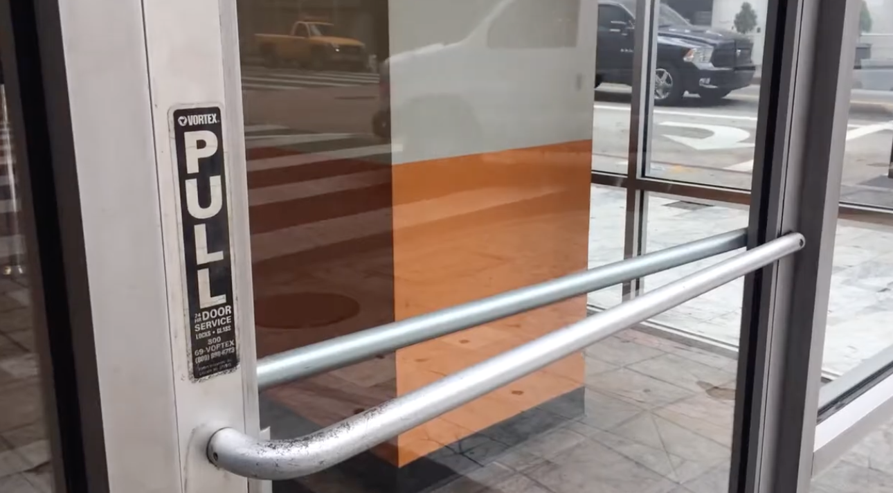
You’ve done it. Everyone has. You walk up to a door, see a handle, grab it, and pull — only for the door to not budge, because it actually needed to be pushed. You glance around, embarrassed, then notice the small printed sign: “PUSH.”
That split second of confusion has a name in design circles: a Norman door. It’s one of the most widely cited examples in user experience (UX) design, and understanding why it happens is one of the fastest ways to understand good design in general — whether you’re designing a door, a mobile app, or a checkout flow.
This post breaks down where the term comes from, the two core concepts behind it, and how the same failure shows up again and again in digital products.
What is a Norman door?
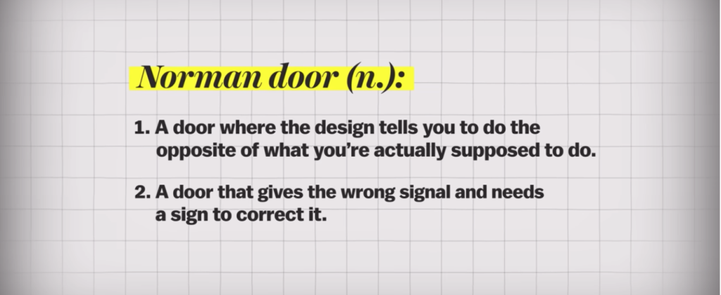
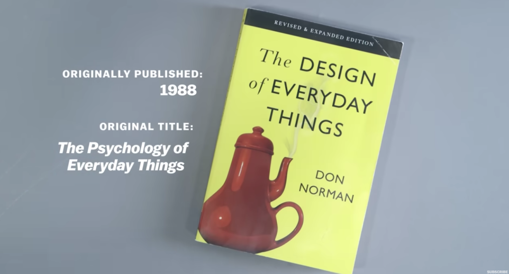
A Norman door is a door — or by extension, any object or interface — that is so poorly designed people can’t figure out how to operate it without an external label or instruction. The term comes from cognitive scientist Don Norman, who used it as the opening example in his influential 1988 book The Design of Everyday Things.

The core idea: if a door needs a sign that says “push” or “pull,” the design has already failed. A well-made door tells you what to do just by how it looks. You shouldn’t need instructions for something as simple as opening a door.
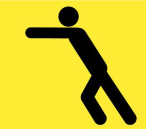
Push Door
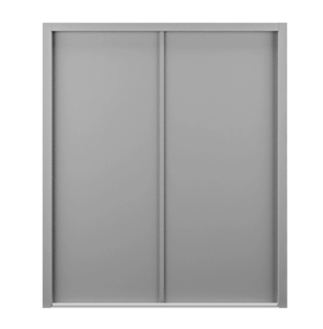
It should be completely flat, Which gives the hint for humans to push.
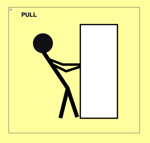
Pull Door

It should have a dented space around the handle which hints the human to pull. For example all car doors have a small dents that hints human brain intuitively to pull the door.
The two concepts behind the Norman door
To understand why some doors (and interfaces) confuse people, you need two terms from Norman’s design vocabulary.
Affordance
An affordance is what an object actually allows you to do. A flat plate can only be pushed. A long vertical handle can be gripped and pulled. The physical form of the object defines the set of possible actions.
Signifier
A signifier is the visible cue that tells you what the affordance is. A flat plate signifies “push here.” A handle signifies “grip and pull.” Good design uses signifiers that clearly and accurately communicate the real affordance — so you know what to do without thinking about it.
Where it goes wrong
A Norman door happens when the signifier lies about the affordance — for example, a handle (which visually promises “pull”) is attached to a door that actually needs to be pushed. Your brain reads the handle, predicts an action, and the prediction fails. Critically, Norman’s point was that this failure is not the user’s fault — it’s a design failure. When people struggle with an everyday object, the object is what needs fixing, not the person.
Real-world examples of Norman doors
- A flat panel with no handle — you instinctively push it. This is a correctly designed door: the signifier (a plate, nothing to grip) matches the affordance (push).
- A vertical bar handle on a door that must be pushed — the handle affords gripping and pulling, so people pull first and are wrong. This is the textbook Norman door.
- Doors labeled “PUSH” or “PULL” — the printed label is a patch covering a broken signifier. A well-designed door wouldn’t need the label at all.
Solution to the Norman Doors in real world
Norman doors in digital UX
The same failure pattern shows up constantly in software and interface design, wherever the visual cue and the actual behavior of an element don’t match.
- Disabled-looking buttons that are actually clickable, or clickable-looking buttons that are actually disabled — the visual style contradicts the real interactive state.
- Flat, borderless “buttons” in minimalist interfaces that look like plain text — a side effect of overly minimal flat design trends. Users don’t realize there’s anything to click.
- Swipeable carousels with no visual hint — no peeking next card, no dot indicators — so users never discover the swipe gesture exists.
- Links styled identically to body text — no underline, no color change — so the “clickable” affordance is invisible until a stray hover reveals it.
- Toggle switches that rely on color alone to show on/off state — this fails for colorblind users and anyone glancing quickly, since the signifier (color) doesn’t reliably map to the actual state.
In the coming days I ll try to add few real examples of bad design and the correct solutions for the bad design.
Why this matters for designers and developers
The lesson generalizes far beyond doors: make what an interface lets you do obvious from what it looks like it does. If your users need a tooltip, an onboarding tour, or a help-desk ticket to understand a basic interaction, the interface has a signifier problem — not a user problem.
Good UX design closes the gap between affordance and signifier so tightly that instructions become unnecessary. That’s the real, lasting lesson of the Norman door.
Key takeaways
- A Norman door is any design that requires an external instruction to be used correctly.
- Affordance = what an object actually lets you do.
- Signifier = the visual cue that communicates the affordance.
- Confusion happens when signifier and affordance don’t match.
- The same problem appears constantly in UI design — buttons, links, toggles, and gestures that don’t visually communicate their real behavior.
- Design failures should be fixed at the design level, not blamed on the user.
